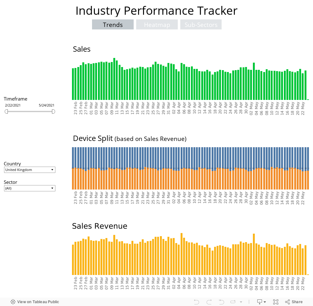
There are three tabs in the report, the first, called 'Trends', looks at top level daily performance for the last three months. The data includes sales, sales revenue and device split between mobile and desktop. Filterable by country and top level sector, the information will be updated weekly on Mondays. Note, that as telco and finance sales often do not have an associated direct revenue, we have omitted the revenue graph for these sectors.
The second tab, called ‘Heatmap’, is presented in a treemap format that shows different sized shapes for each of the sectors that comprise the four main verticals Awin reports on: Retail, Finance, Telcos and Services, and Travel, each then filtered by sub-verticals (such as fashion, health and beauty, etc.). The data shows the percentage increase or decrease of each of those sectors. Hover over each rectangle to see the percentage variance.
This data is then visualised in a series of bar graphs in the third tab, ‘SubSectors’.
The report automatically updates on a weekly basis and also allows you to filter by date range, three metrics (sales, commissions and revenue), as well as country.
We are working to bring you additional visualisations in the weeks and months to come.
Note: the size of the rectangles in the treemap and bar graphs reflect the percentage increase and decrease of those sectors, not the volume of sales, commission and revenue tracked.
You will need to view this report on desktop as it does not configure on a smartphone.